-
For the final stage of the precedent studies, we were to handcraft a model of the building using balsa wood and glue. It was a challenge as balsa wood is extreme fragile, and we were working with a building of small scale and much detail. The project was a success though, as we managed to come up with quite a decent model.
-
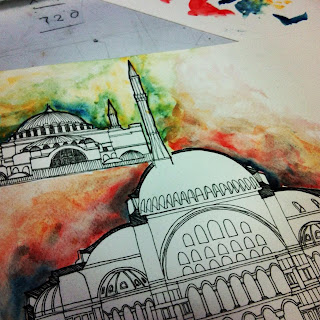
Part 1 of our precedent studies called for a 500-word essay on the topic of Hagia Sophia. It took awhile to conduct proper research as different sources indicated slightly different information. However, we were able to summarize the information, where we took the majority and managed to write out the essay. I also learnt about the Byzantine architectural style, as well as how to recognize a building in the said style.
-
The final project of the semester is an integration of Design Communication along with Architectural Design Studio 1. we were to apply all the knowledge attained in Design Communication to aid in the drafting of our designs in Design Studio 1. This included orthographics, axonometrics, and perspective drawings.
-
As the final assignment regarding basic technical drawing skills, we were required to produce two technical drawings, that being a two-point perspective, and a one-point perspective, respectively. The aim of this project is to further build up skills in three-dimensional visualisation, as well as to give a better understanding of spatial ideas and architectural detail.
-
Working on the same building, we were to draw and render an exploded axonometric drawing in a scale of 1:50, and to highlight specific parts of the structure according to our personal preference.
Learning how to properly complete this assignment, one had to know ho to properly visualise the structure in a three-dimensional format, whereas previously we only had to deal with two-dimensional technical drawing.
In my drawings, I chose to highlight the marble walls that make up the structure. The technique and media of my choosing was colour pencil rendering. -
For this project, the same building was assigned to the whole class, the Barcelona Pavilion, designed by Mies Van Der Rohe. We were then required to conduct intensive research on this particular structure and draw out its plans, sections, and elevations using proper drafting techniques, including proper lineweights and renderings.
-
The task for project 1(b) was to choose, arrange, and photograph one or more object(s), and ensure that the composition of said objects gave off a clear line between object and shadow. Then we were to redraw it out using four different drawing techniques, cross-hatching, stippling, scribbling, and hatching.For my object, I chose a set or crayons, arranged in triangular layers.The Idea of this practice is to give a better understanding of how to properly project proper tonal values onto paper while using different techniques to show different texture. This also enables one to properly differentiate between the several spaces in a drawing composition.
-
The task of this project was to go to a specific site and sketch. The project aims to polish sketching skills as an architecture student, as well as further embellish an understanding of how to properly project the spatial values of a certain place. Sketching skills are of utmost importance as it is one of the main modes of communication in the architect-client relationship. Practice in sketching also helps develop visualisation skills, an important asset in designing.
-
The final project for the semester asked us to imagine, design, and present about our imaginary hideout in a sci-fi movie. The movie my group were tasked to watch was Fifth Element. Although this was an individual project, we were divided into groups to ease in the construction of the site model. These were the screenshots we chose from the movie:
The site model:
Progressing on from the movie, we were to create a character for ourselves, before proceeding on to design a hideout based from the character. this was my hideout.
-
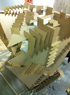
The first major project of the semester, a several weeks long project, basically required us to plan, design, and construct a 1:1 scaled model with the dimensions of around 2metres x 2 metres x 1.5 metres. This project was a continuation from Project 1, where we had to form groups of 3 members, and design a space by combining the concepts of three persons' characteristics. the whole structure had to be constructed solely out of cardboard.We had several pre-assignments leading up to the final construction.The first, a photography task where we had to play around with how the body moves and positions itself in relevance to space.
The second, an individual model studying the photographs we took and how we could translate that into a series of spaces.
The third, a series of mock-up models combining ideas from three different people.
And finally, our 1:1 scale cardboard model.
It was an interesting project, to say the least, and I did learn a few things from it. Rather than merely re-copying the learning outcomes stated in brief, I found that designing, no matter how trivial it may be, is not easy. Of course, one could simply come up with something that looks good, but the trick in designing is to have the concept, and meaning behind it. We learnt that the hard way, with many ideas and mock-up models being rejected. However, at the end of the day, everything worked out, and these lessons, I am sure, will stay with us throughout our designing days. -
Self expression. Thus was the title for the first official assignment of the semester, where we had to express ourselves through any means to our preference. In other words, we were to express our personality and traits in the form of art. This project is a continuation from the self-portrait, thus elements of it had to be kept, or altered so as to show progressive work. We also had to properly present our works and explain the story beneath the art.
As prep for Project 1, we were to create a self-portrait of sorts, to best represent our personality; characteristics, and etcetera. My self portrait was an illustration of a cat; with flowers each symbolising a certain trait or characteristic. It was interesting to be able to implement a part of ourselves into a part of our work, even if it was merely a drawing. Also, thorough research was done about symbolism, a subject that I personally adore.
Moving on to a closer view towards the final outcome;
Subscribe to:
Comments (Atom)


